Data Collection and AnalysisFrom Trackpedia
Data Collection and AnalysisBrought to you exclusively by: Academics who study the things that motivate people to do the things that we do break them down into 4 categories.
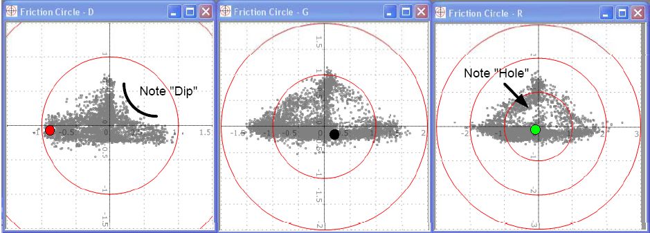
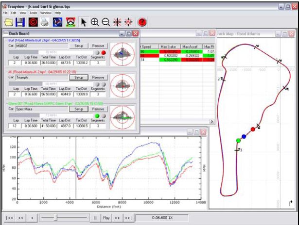
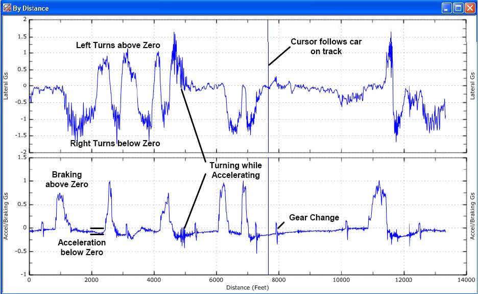
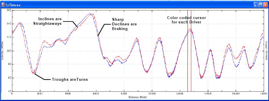
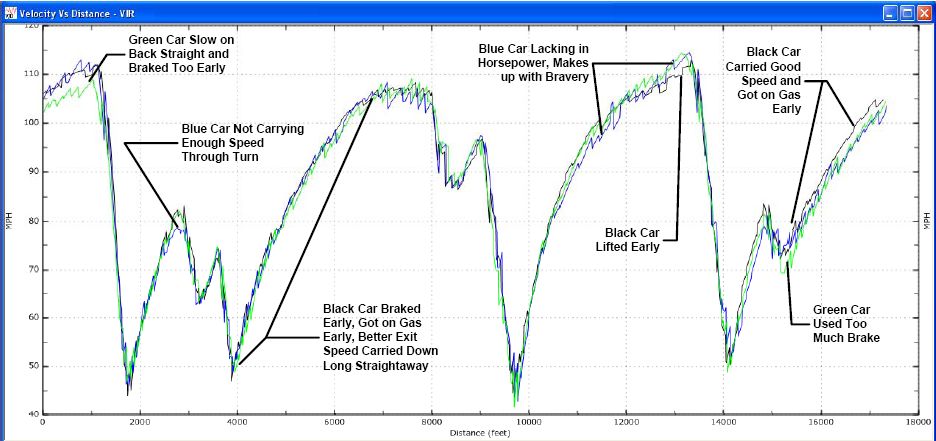
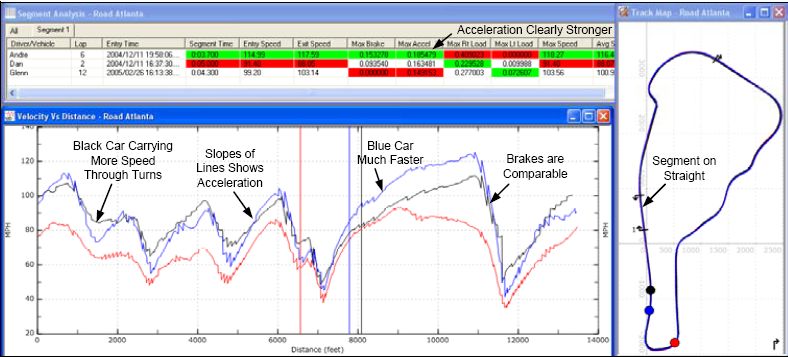
We're all affected by motivations from all of these categories, but if you're on this site and you take your car to the track, it's a safe bet that the Achievement Motivation is one of your highest. In whatever you do, it's the drive to go back and do it again, only better. Data Collection gives us the information we need to understand our performance and increase what we can achieve with our cars on the track. There is a continuum of data that you can collect, from simple tire pressures through G-force Circle plots. If you race too quickly along that continuum, you'll become overwhelmed, and will not be able to make the most of the data. We've attempted to document this continuum, but as you can imagine, there are a lot of different views on what should be done and when. Consider this as a general consensus, but apply it as it fits your particular situation. There are no rules, just advice. Data Collection ContinuumTire PressureTire pressure is the first thing you should start measuring at the track. First of all, from a safety standpoint, you should measure the pressure before each session. It makes sense to write them down and start looking at how they change over the session. They key is to measure the pressure as soon as you can after you come back to the paddock. Analysis: Tools: Tire pressure gauge: Get a good one, but you don't need to go overboard. Try to use the same one all the time, to accommodate for any inaccuracies. Tire TemperatureLike Tire Pressure, it's a good idea to measure the temperature as soon as you can after you get back to the paddock. Analysis: Take the temperature at the outside, middle and inside of each tire, and you can start to understand if you have issues with the camber of your tires. If one corner of your car is significantly higher than another, you might have balance problems, or you might be taking a certain type of turn differently than another. Rear heat vs. Front heat might help you seen the affects of under steer or over steer. Tools: There are two main types of pyrometer, a probe type pyrometer, where you stick small probes into the tires, and the infrared pyrometer, which reads the temperature from a distance. Weather ConditionsAnalysis: You may end up adjusting your tire pressures to accommodate for extremely high and low temperature situations, or when the track is wet. Tools: Weather report Lap TimeYou might expect this to be first in the list, since it is usually how we measure achievement. I've put it after Tire Pressure and Tire Temperature because you really want to make sure that your tires are in good shape and holding up before you start running time trials for a top time. I've put it after Weather Conditions because the weather will play a big role in how fast you can really push your car and yourself... and hey, where can you get a better excuse than the weather! Sector TimeWhile the lap time gives you an overall metric of how fast you drive per lap, the sector time helps you understand how fast you maneuver through different sectors of the track. Traditionally, the track is broken up into 3 sectors: the start/finish line to 1/3 section of the track, from the 1/3 section to the 2/3 section and the last sector finishes off from the 2/3 section back to start/finish line. But with the recent use of a GPS data logging system, one can define the number of sectors to examine on a single lap. This can achieved for example by defining a lateral G-force range or even personal preferences. VideoOne good way to replay a session and look for good and bad habits is to videotape your session. There is a page Videoing_a_track_day that talks specifically about videoing a track day, but don't overlook the benefit of having a friend tape your session from outside the car. A static view of how you manage a turn compared to others can be very helpful. Video when combined with data can provide you with a great visual reference to what is actually happening every second you are on track. The combination can improve driver performance by backing up the visual information with hard data. Data GatherersAt this point, you're probably past the point of a notepad and pencil. There are a range of data gatherers out there that can dramatically improve your ability to collect complicated data on your track excursions. These typically use GPS and Accelerometer data to provide a very detailed picture of what your car is doing on the track. SpeedGives you data at entry and exit of each segment of the track. The speed data is gathered from one of the wheel speed hall sensors. This data is transmitted to the needle you see in your instrument cluster. The smooth motion of the speedometer needle is the result of a filtered signal. This signal is also calibrated to the size of the tire outer diameter. Hence by changing this diameter, the speed signal will be altered as well. In a professional data acquisition setup, the race engineer usually installs four wheel speed sensors, ie one at each corner. One of the reasons for doing this is to observe data related to tire slippages. The other method for gathering the speed data is through GPS. A data acquisition unit, like the G2X and Traqmate, uses GPS to provide this data. Lateral-GsHow much grip do you have and how smoothly do you apply it. Friction Circle Often you can get a quick idea of driver’s skill by simply looking at their Friction Circle plot. A beginning driver will generally have a plot that appears like an inverted T with dips on the sides. This is because they brake straight, get off the brakes, then turn. As a driver gains experience, his Friction Circle will be much more triangular and follow the perimeter of a triangle. This happens because the driver is transitioning from braking to turn-in in a coordinated fashion. A very experienced driver’s Friction Circle will have a visible hole in the center showing that the maximum grip of the car is being used at all times. When playing back in real-time you can see the cursor go around the outside of the triangle. To determine how much of the performance of the car is being utilized, do a skidpad test as described in the vehicle performance section below. Longitudinal-Gs (Linear-Gs)Longitudinal G-forces are those associated with throttle input and brake input. The acceleration data from throttle input easily and immediately shows power increases or decreases that may have occurred from changes to the setup (air filter, oil filter, turbo addition, et. al.) as well as indicating a possible problem with the car -- such as a slipping clutch. It can also be used as support evidence for driver issues such as over-driving out of a particular corner. In which case, both the longitudinal and lateral g graphs would both be more saw-toothed instead of the desired smooth arc. However, throttle acceleration data is more likely to be useful to the car engineer rather than the driver. Conversely, braking longitudinal g's are a very important data point for the driver. It will clearly and quickly show how smooth and consistant the driver is in the braking zones. Also whether or not they brake early, trail brake, and lock-up the tires. (... to be continued ...) Conan 07:05, 25 April 2007 (PDT) RPMNeeds to be hardwired into your car. The engine RPM data is after all a speed data in a rotational sense. The RPM sensor is also hall sensor located near the crankshaft. This data is transmitted to your instrument cluster known as the tachometer. Much like the needle in the speedometer, the tachometer needle is a filtered signal as well. Most data acquisition systems has a separate line to be hardwired into the car. This can be achieved either through the ignition coil signal or the On Board Diagnostic port. Knowing the RPM data is crucial for understanding how the car performs on the track and whether gear shifts are performed optimally. Together with the speed, throttle position sensor, lateral and longitudinal G force , it can also provide the race engineer how the driver maneuver his/her right foot through a certain corner. Data Gathering OptionsParticipants in this site have experience with many types of Data Gatherers, most notably the Traqmate, and the G2Xtreme. Click the links to these pages to learn more about each of the devices. Now that we have all the data, what's next?We live in a data rich but information (or knowledge) poor environment. There is an entire industry out there that focuses on optimizing data-mining in every possibly field one can imagine. This ranges from banking to medical and from insurance to aeronautical sciences. Data Collection (or acquisition) is perhaps the simplest process of understanding how to increase our driving performance on the track. The more challenging process of course is how to gather useful information from the data we collect. [to be continued] Traqview A data acquisition system is only as good as the analysis program. Traqview is a new approach that merges hard-core data analysis with the fun of a video game. The track mapping is accurate and gives an instant read on what is happening where. Multi-car playback lets you see graphically who is faster where. Record several cars in a race and replay the entire race in real-time, slow-mo, or fast forward. See their speed, G loads, braking and acceleration for every car on the virtual dashboard. Traqview has all the tools you need to optimize the performance of both car and driver. For example, you can display graphs like Velocity vs. Distance to see who is faster in which corners and then define a sector on the map and zoom in to see braking points, instantaneous velocities, acceleration points, and transfer speeds through a corner. Traqview is your single point of contact for everything in the Traqmate System. Use it to upload data from Traqmate, analyze the data, configure Tracks, Drivers, Vehicles and optional Sensors, change the Sampling Rate, and even download future software and feature upgrades into your Traqmate. Track Map The Track Map is the heart of the GPS Data Acquisition System. G vs. Time The G vs. Time Graphs (Lateral and Accel/Braking) are just like the G vs. Distance Graphs (see below) only they are plotted over time instead of distance. Therefore, it is most useful for analyzing a single vehicle since two different laps will not match up on the time scale. If you select several laps they will be shown end-to-end so you can see a progression of the G levels obtained during a session. G vs. Distance The G vs. Distance Graphs (Lateral and Accel/Braking) show the G forces that are occurring at each place around the track. By playing back a lap and following the vehicle icon on the Track Map and the vehicle cursor on the G vs. Distance Graphs, you can see exactly what happened such as a touch of the brakes or a steering correction in the corner. This is a very useful graph for comparing two driving styles. Velocity vs. Distance This is the most useful graph for comparing two or more drivers or cars. You can get an instant read on where a driver is carrying more speed through a turn, which car has the best top speed at the end of a long straightaway, and which car accelerates the best. It is easy to determine which trough is which turn by playing back the vehicle position on the Track Map and watching the cursor positions on the Velocity vs. Distance Graph. Friction Circle
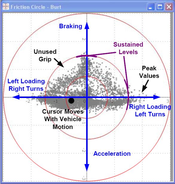
The Friction Circle graph shows the forces acting on the vehicle in the forward, reverse, left, and right sides, plotted on an X,Y Graph where the vertical axis is Braking/Acceleration and the horizontal axis is Left/Right Loading. For most vehicles, the shape of the Friction Circle graph will be an inverted triangle. The reason for this is that most vehicles stop much better than they accelerate so more forces will be generated in that direction.
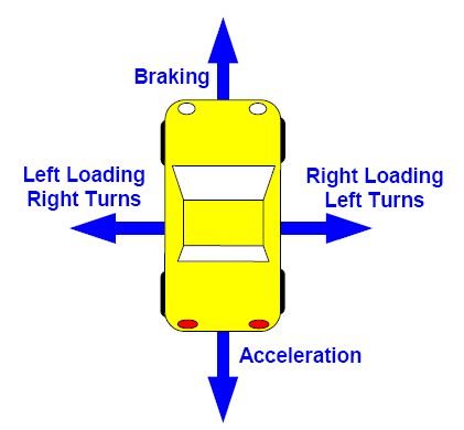
This graph is used to gauge the overall amount of performance available in the car and the amount of that capability the driver is using. Especially of interest are the transitions from braking to turning to acceleration. By watching the cursor move around the graph during playback, you can see the transitions. It is useful to picture the car from overhead as in the diagram and think of the cursor as the top of the driver’s helmet.
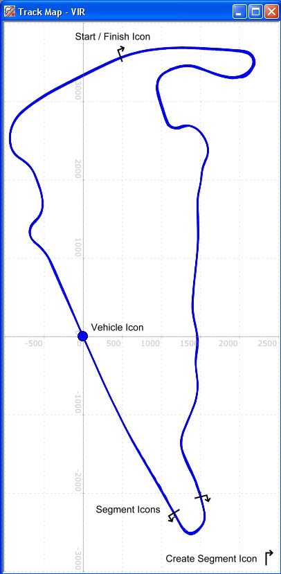
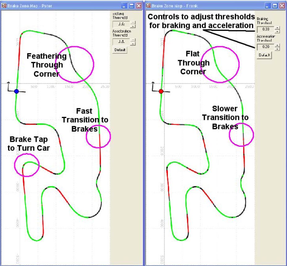
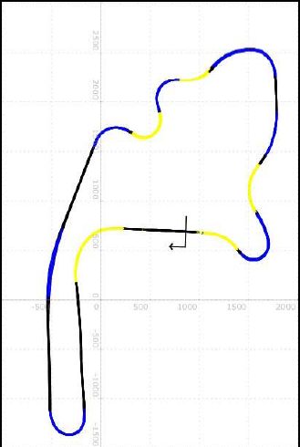
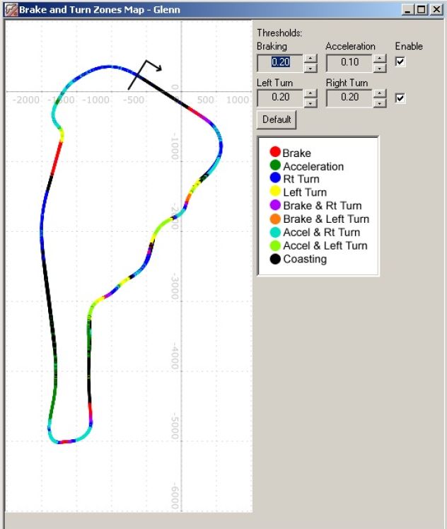
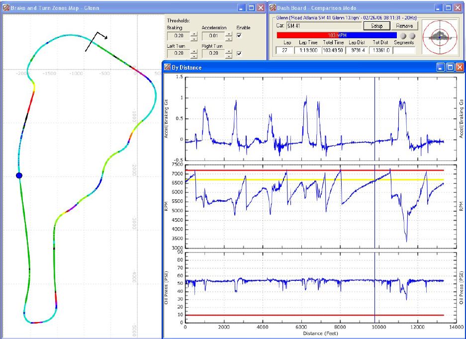
Note that the Friction Circle shows peak loads. A tire near maximum grip level is constantly gripping and releasing the pavement. In addition, a hard turn-in will generate instantaneous loads that are not sustainable. The extremely sensitive accelerometers will pick this up, creating peaks in the data. While these are real, the actual sustained level of grip that can be measured on a skidpad is somewhat lower. Braking and Acceleration Zones The Brake Zone Map shows the forward/reverse forces acting on the vehicle and where they occur on the track. This graph will show what a driver is actually doing on the track. As you can see from the illustration below, this includes where the driver is flat or where they are lifting, techniques such as lifting to orient the vehicle, how fast the driver’s transitions are from brake to acceleration and back. Many times you can even see shift points! Enable the Brake Zones with the enable control on the Brake and Turn Zone map. Use the Braking and Acceleration threshold adjustments to tune the map to your particular car and reveal hidden information. Turn Zones The Turn Zone Map shows the lateral forces acting on the vehicle and where they occur on the track. This graph is primarily used to show turn in and turn out points. When combined with the brake zone map you can see trail braking and where the acceleration is applied during the turn. Enable the Turn Zones with the enable control on the Brake and Turn Zone map. Use the Turn Zone threshold adjustments to tune the map to your particular car and reveal hidden information. Right turns are shown as dark blue and left turns are shown as yellow. Black is shown where the vehicle is traveling mostly straight. You can use these transition points to set up segments on a reference lap, save as a .tqs file, and then add laps to it later to see if speed has been gained or lost in a particular set of turns. When you enable Turn Zones and Brake Zones at the same time, you get a combination of colors. While the “rainbow map” may seem confusing at first there is a lot of useful information contained in those colors. For example, braking is Red and right turns are Blue. If you see a Purple segment that shows that the driver was braking and turning right at the same time (i.e., trail braking). Similarly, Orange indicates trail braking into a left turn. Chartreuse and Turquoise show turning while accelerating, which can reveal where the throttle is applied during a turn. Experiment with the thresholds to reveal even more information. Segment Analysis
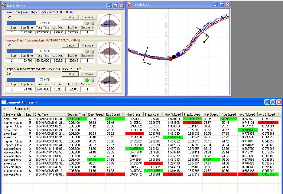
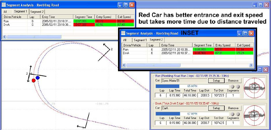
One of the most powerful features of Traqview is Segment Analysis. This allows you to compare two small sections of the track on several laps. This is especially useful for comparing two drivers who might take different approaches to a corner or for doing a before/after comparison of a new technique or driving line.
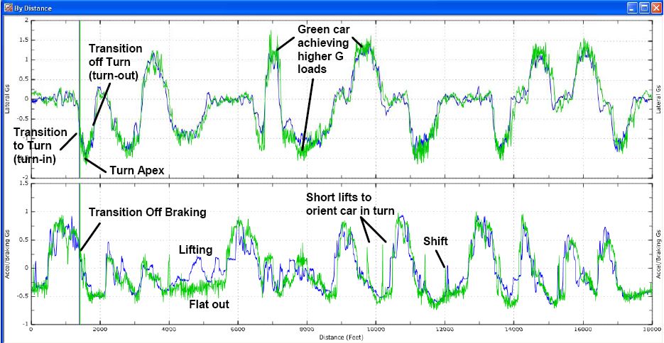
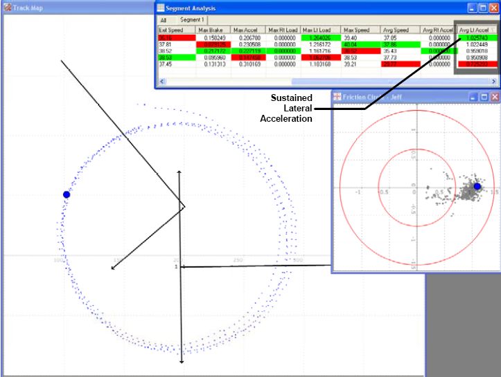
Using Traqmate for Analysis This section will serve as a tutorial for using the Traqmate Data Acquisition System for analysis of drivers and vehicles. There are many ways to use the data and these are only a few methods. It is always best to experiment to find the specific areas of interest for your situation. Driver Comparison When comparing drivers, it is best to record laps in the same vehicle or at least very similar vehicles. Otherwise, the performance capabilities of the vehicle can mask the differences in the drivers. In addition, driving styles differ between types of cars. A good driver will have different braking, turn in, and acceleration points in a front-wheel-drive car than in a rear-wheel-drive car. Best Lap Playback The easiest way to compare drivers is to pick their best single laps, load them up on the track map and play them back. Watch the entire lap and note where one driver pulls away significantly from the other. Then concentrate on those areas using the other Traqview tools. Best vs. Worst Playback Sometimes you can see differences most readily by taking the best and worst laps of a session for a single driver. This can make mistakes more apparent. Velocity vs. Distance Driver differences are most apparent when viewing the Velocity vs. Distance graph. To get an accurate picture you may need to look at several laps because you never know what happened on a single lap. A driver might have lifted to avoid another car or may have had the advantage of a draft from another car on a straightaway. After looking for areas of improvement on the Velocity vs. Distance Graph, you need to determine just how to make those improvements. The best way is to create a segment surrounding the corner on the track to be improved. Driving Line Generally, it is best to be “Slow In, Fast Out”, especially if there is a long straight after the turn in question. That faster exit speed will compound over the entire distance of the straight. Segments are the perfect way to test entrance speed vs. exit speed. If you are entering a long complex of curves, it may be smart to be Fast In, Slow Out. The best way to determine this is to create two segments on consecutive sections of the track. This way you can see if sacrificing entrance speed on one section leads to commensurate gains on the next section. Segments Sometimes entrance and exit speed can be deceiving. Segment Analysis can also show you the real story. In this diagram, taking the long way around results in higher speeds but longer times. G vs. Distance Analysis The G vs. Distance graphs show the G forces on the vehicle plotted against the distance traveled. This is very useful for viewing the overall performance envelope that a driver is using in the car. On the graph below you can see that the green car’s graph lines are consistently outside the blue car’s, indicating that the green car is carrying more speed through the turns and consequently generating more lateral cornering force. Another useful element of this graph is the ability to determine when a driver hits the brakes and throttle. You can clearly compare when each driver hits the brakes, gets off the brakes, and gets back on the gas. This graph is also good for comparing braking curves for the drivers. Optimally you want to see a good crisp initial brake pressure, even pressure during braking, and then a clean transition off the brakes and into the turn. If you position the cursor at the end of the brake application (as shown), it should also intersect the turn in point. Also look for nice smooth lines. Spikes in the acceleration line indicates a throttle lift or brake tap, which is usually not desirable. Friction Circle Often you can get a quick idea of driver’s skill by simply looking at their Friction Circle plot. A beginning driver will generally have a plot that appears like an inverted T with dips on the sides. This is because they brake straight, get off the brakes, then turn. As a driver gains experience, his Friction Circle will be much more triangular and follow the perimeter of a triangle. This happens because the driver is transitioning from braking to turn-in in a coordinated fashion. A very experienced driver’s Friction Circle will have a visible hole in the center showing that the maximum grip of the car is being used at all times. When playing back in real-time you can see the cursor go around the outside of the triangle. To determine how much of the performance of the car is being utilized, do a skidpad test as described in the vehicle performance section below. Graphing Multiple Data Elements (Stacked Graphs) With Traqview, all the items on the graph are synchronized as you play back one or more laps. Use the Setup button on the dashboard to add elements to the common scale distance or time graphs and then play it back to see the relationship between the various elements being monitored. As you configure Analog and Digital points in Traqview, they are added to the available items in Setup by name. In this graph, Oil Pressure and RPM have been collected using the TraqData input device. In this analysis you can see the brakes applied before the turns, you can see the RPM peak at the redline, shift points in both the track map and Accel/Braking graphs, and the RPM drop after a shift. You can even see the oil pressure drop when the engine is unloaded during a shift. Vehicle Performance Comparison Traqmate can measure many performance capabilities of the vehicle, including acceleration, braking, and lateral grip. Acceleration and Braking A good way to evaluate horsepower is to draw segment on a straight part of the track between shift points and in the brake zones. Then look at the Max Acceleration and Max Braking values in that segment. You can also see the difference in power between vehicles visually by looking at the slope of the lines in the Velocity vs Distance Graph since the rate of gain of velocity is acceleration. Similarly, by looking at the negative slope one can determine the strength of the brakes (and of course the adhesion of the tires). Lateral Gs To evaluate the outer limits of chassis adhesion, the proven method is the skidpad. Traqmate is an ideal tool for collecting and analyzing skidpad data. Share & Compare – Trading Laps Online at Traqmate This innovative feature allows you to upload and download laps from around the world. You can quickly learn what you are doing right (or wrong) by comparing yourself to other skilled drivers. Great way to guage your driving skills as well as compare your car against others. Create the virtual race you have always dreamed of with Traqmate. Reading the Friction CircleFriction Circle
The Friction Circle graph shows the forces acting on the vehicle in the forward, reverse, left, and right sides, plotted on an X,Y Graph where the vertical axis is Braking/Acceleration and the horizontal axis is Left/Right Loading. For most vehicles, the shape of the Friction Circle graph will be an inverted triangle. The reason for this is that most vehicles stop much better than they accelerate so more forces will be generated in that direction.
This graph is used to gauge the overall amount of performance available in the car and the amount of that capability the driver is using. Especially of interest are the transitions from braking to turning to acceleration. By watching the cursor move around the graph during playback, you can see the transitions. It is useful to picture the car from overhead as in the diagram and think of the cursor as the top of the driver’s helmet.
Note that the Friction Circle shows peak loads. A tire near maximum grip level is constantly gripping and releasing the pavement. In addition, a hard turn-in will generate instantaneous loads that are not sustainable. The extremely sensitive accelerometers will pick this up, creating peaks in the data. While these are real, the actual sustained level of grip that can be measured on a skidpad is somewhat lower. Friction Circle Often you can get a quick idea of driver’s skill by simply looking at their Friction Circle plot. A beginning driver will generally have a plot that appears like an inverted T with dips on the sides. This is because they brake straight, get off the brakes, then turn. As a driver gains experience, his Friction Circle will be much more triangular and follow the perimeter of a triangle. This happens because the driver is transitioning from braking to turn-in in a coordinated fashion. A very experienced driver’s Friction Circle will have a visible hole in the center showing that the maximum grip of the car is being used at all times. When playing back in real-time you can see the cursor go around the outside of the triangle. To determine how much of the performance of the car is being utilized, do a skidpad test as described in the vehicle performance section below. Predictive Lap (or Theoretical Lap)Predictive Laps can be created by breaking down your best laps into segments. Each segment that is the fasted can then be put together with the other fasted segments to create your fastest possible lap. Consistency of Braking and Throttling ZoneOversteering or Understeering Behavior |
